Tuesday, 30 November 2010
Monday, 22 November 2010
Monday, 15 November 2010
Wednesday, 3 November 2010


Thursday, 21 October 2010
Film Magazine Cover Construction
 I then made some slight final adjustments of moving things to be properly in line with eachother (the barcode and sell lines) I also moved the masthead across a little bit so that there was more of a border round the edge and made the gap between the sell lines on the left smaller so that the text looks linked together. I'm quite proud of what I've made; I think it looks different and fairly cool, and I still think it is inkeeping with the tone of the other products I have made, whilst being a fairly appealing magazine cover.
 I added a strip of text across the bottom of the page and more sell lines, to make it look more authentic, which was suggested to me after showing what I had made so far to people who could fit in with my target audience. I also changes the wording of "The Rise Edition" to "The Rise Issue", because I thought this fit in more with the typical institutional language seen on magazine covers.
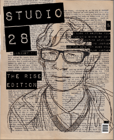 I turned the barcode round and added a price to the cover. I also began to play around with using different sizes of text and adding other sell lines and a date. The only problem is that all the text on the cover is in the same font, so there isn't really any differentiation between the masthead and sell lines, which isn't typical of a normal magazine. It is also very hard to position this particular font, as the background can fill the gaps where the letters are, making the text unreadable. However, I think the font fits really well, so I will just have to position it where it is readable, rather than where I ideally want it to be. The problem of all the text being in the same font, which is I hadn't originally intended to do, I don't think looks too bad. I think because of the text in the background, the black behind the letters really works and it has a kind of vintage feel, as it's mimicking old sticker machines of past decades, fitting in again with the themes and focuses of the trailer itself. The barcode doesn't really seem to be at ease with the rest of the cover yet as well, which I think I will have to alter. I obviously also need to add more sell lines and features that the magazine will contain, or it might look a bit dull. I don't want to make it too loud and exciting however, because I would still like it to reflect the feelings of the trailer itself. Due to this I don't think I will include any secondary pictures for secondary articles.
 Then I began to insert text and a barcode. I couldn't find a font that was bold enough to fit in with the background, but not too much to overcomplicate the so far quite simple look of the cover. I really like the font I chose in the end, which was downloaded from http://www.dafont.com/, and I liked the way it kept in with the handmade look of the whole page. I like the way that the pages in the background create a kind of border with their own borders around the edge of the cover, which I think I could use as a kind of guide for the sell lines. Some of the pages are upside down, and not so neatly aligned, because I thought it would look dull if they were all correct and accurate, whereas now it has a slight edge and difference about it, which is the look I wanted it to have.
 I then stuck the plastic over the book pages with masking tape, and scanned what I had made in, to add text and maybe other images to it in photoshop. I made the cover to the dimensions of 24.4cm to 19.6cm, which was what I originally intended to do. I found the process of scanning in what I had manually made to then electronically process much easier and more practical for what I wanted to do instead of making the whole cover in photoshop. Also, in this way the process contributes to the mise-en-scene/genre of an independent, past referencing film magazine; and edition of which is featuring a film centered around the same subjects.
 However, instead of choosing one image, I put one over the other which I thought looked quite good, and when you moved one piece slightly, I really liked the outcome of all the different lines lying different ways over eachother. I suppose if you wanted to read a meaning into the image, as though you were studying the mise-en-scene of the cover, you could link it to the dullness and plainness that the main character experiences, without having anything to fill the gaps he feels mentally and emotionally.
 I liked the look of this and I couldn't decide whether or not it looked better with less or more detail, or with or without his glasses blocked in as they seemed to be a bold focal point in both the poster and the trailer. So, I drew out both of these on seperate bits of ripped up wallet to see which looked best.
 I then began experimenting with different materials. I tore up a plastic wallet and used the transparent plastic to trace the outline of the subject in the photograph. I thought this looked quite cool and "graphicy". This also fulfilled the intention of wanting the magazine cover to look arty and unconventional and I thought it would look more subtly striking and attractive to trendies, who are attracted to exclusively cool things.
 I then thought about a background, and so referred back to my original flatplan, on which the background consisted of old book pages. I ripped some out of an old penguin book and placed them behind the photograph. I thought it looked good because the yellowing pages added a different dimension to the greyscale image. Also, because they were yellowing, they referenced the past, which I wanted my character to do in the film trailer. The book pages furthered in their use, as they subtly hinted at the influences of the character and the obsession with cult/old/vintage items/music/books.
 I began by looking at the images I had taken on location and deciding which would look best on an arty film magazine cover. I desaturated the image to make it greyscale (keeping the theme threading through all three products) and printed it off so that I could work manually to give it an authentic DIY look. I cut round the image in straight lines using a scalpol and ruler.
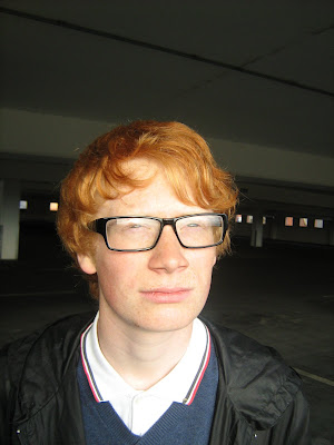
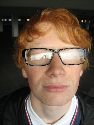
Tuesday, 5 October 2010
Film Poster Construction

 To try and make something a bit different, I made the image much larger and placed the image over the text (done by cutting and copying). However, this made the white credits barely visible, so I changed them to white, and made them smaller, so that they would all be visible on the white of the subject's collar. This took quite a long time, but after I had made all of these alterations, I decided that I liked it much better how it originally was, when the image was not so close-up and there was more in it. So, I went back to the copy before this was done and I moved the credits around so that they looked sharper and more well-placed. But because it isn't a product made for just me, I asked people who could be part of my target audience which they preferred before I changed back - everyone said they preferred the original one, because it was "more spacious and isolated... more imposing because it looks like it's looking down more... the title fits in better as well".

The next thing I did was cut away my subject from the background, so that I could leave the face very pale and drawn out, whilst making the background darker so that the text can stand out. When I did this, and edited the image to how I wanted it, because I had used the magnetic lassoo tool to cut out my subject's head, it looked as though the image of him had been taken in a different location to the background and pasted on top. At first, I wasn't pleased with this and wanted to change it, but then I looked at it differently and found that I quite liked the "D.I.Y" and rough look that it gave the poster and I decided to keep it.

 I made my film poster in Photoshop to A3 dimensions and inserted the title, (in the same font that was included in my trailer), logos and the image I wanted to use. In the flatplans I made, and which I am currently working from, the title was intended to be in black. However, as the two above screenshots show, a black title would have been very hard to read, and this was before I had edited the image to increase the contrast levels, which would have probably made the readability worse. I also asked 10 people from college which colour title they preferred and 8 out of 10 agreed that the white looked much more punchy and effective. So, I decided to use a white title, as it stood out from the background, and I don't think it looks as gloomy as the black, as white could hold connotations of hope, innocence, difference and bleakness; all concepts and ideas related literally to the title of "RISE.", or, if not, they do relate to the concepts in and behind my trailer. When I asked members of my target audience what they initially thought of my poster, I recieved comments such as "the fact that it is in greyscale is very effective... it makes it look sad and intense... it looks bold", which all seemed like I was making a positive start.
Tuesday, 28 September 2010
Trailer Construction

This is the third rough cut of my trailer. I have gotten rid of the soundtrack that I made in Garageband, and imported some sound files that I recorded myself; one on an acoustic guitar and one on an electric using a "FuzzBrite" and "Danelectro" pedal. These pedals gave quite a good 60s/garage sound, which sadly became slightly distorted when I recorded it through an amplifier using a microphone. Below is a picture of the guitar and equipment I used, recording the sound into a laptop.


This is the first rough cut of my trailer. Basically, so far I've captured/imported the footage and institutional logos, putting them in order in coordance with my storyboards and uploaded it to see what it looks like so far. I used the "desaturate" tool in Final Cut Express to make the footage greyscale, but as you can see I missed out one shot by mistake. There also isn't any soundtrack, so it looks a bit dull and boring, which I will try to change. It's quite long at the moment, at 2 minutes 32 seconds, so I may have to shorten some shots as trailers aren't really that long normally. I think there are some good shots in my trailer however, and I am pleased with the voice-overs/monologues and how they fit with the footage. I need to alter the sequence of shots towards the end of the trailer, which I can't do until I have a soundtrack, because I intended them to be fast-paced and in time to some 60s sounding music. I like that the look of the trailer is quite rough and plain and I think it fits in well with the narrative.

This is a screengrab of using Final Cut Express, which I am using to create my trailer. I'm suprised at how quick and easy the process of getting used to the software has been and I enjoy using the programme. However, there are still alot of features that I have not used, or featured in my trailer. I plan to do so during the process of making the trailer.
Thursday, 23 September 2010
Soundtrack Problem
Sunday, 12 September 2010
Shooting


 These are some photos taken during filming, showing me capturing shots of Carol leaving the house as shown in the storyboard.
Shooting Schedules


During the filming, I decided to get rid of the shots where passers-by in the street were shouting "Oi wanker" at the main character. This was partly due to not being able to get all my models together at the same convenient time, and it was also partly due to the fact that I had quite a lot of footage and I thought for the purpose of the trailer that it wasn't needed and it would save time, leaving more chance to get other good shots.
Wednesday, 8 September 2010
Alterations to Plans


This change also meant changing the main character's name, of which he now has none. I thought that as there are no names mentioned, this wouldn't matter and also adds an absence/sense of removal that could reflect isolation. Also, other films that I like have the feature of nameless characters, such as "Withnail And I" and "Is Anybody There?" - a name adds identity and a past which I don't want my character to have because I want him to be purely relateable.
Sunday, 29 August 2010
Risk Assessment and Hazard Evaluation
 The sheets below assess the dangers in the South Park.
 These are the sheets assessing the risks in the house I want to shoot in.
The sheets below correspond to Feethams disused football ground.
 The sheets below are for the Cornmill Shopping Centre car-park.
 The sheets below are for the back lane I want to shoot in.