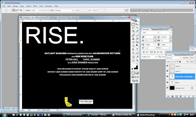
 Below is the finished frame.
 At first, I found this process quite hard because I hadn't used the software for a while and I really liked the flatplan designs I made of the logos, and I didn't think they would look anywhere near as good when the "handmade" element/effect was taken away. This thought especially applied to the "Daylight Shadows" logo. Below is a shot of my first attempt of the logo. I found it really hard to get the text how I wanted it to look and it looked too altered and fake. So, in an effort to overcome this problem, I went back to the scanned in image I had when designing the logos to see if I could create a logo from this image.
 This was the outcome for the second attempt. I much preferred the simpler colour scheme and the lack of fancy effects that I think improved upon my first try. However, it still felt abit static and dull. So, I tried moving the logo about I found the result was more aesthetically pleasing.
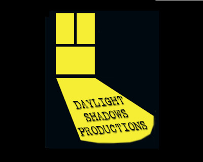
This was the final version that I am happy with. I achieved the angle that the text is on using the "skew" tool in photoshop (pictured below) and I added the effect of a drop shadow (shown below) to make the image look a bit more 3-D and not completely static. I know that the logo isn't very exciting or full of effects, but I like the simplicity about it, because most independent film logos are just flat image with text, so I think mine would fit in if it were to be made into a real logo. (Drop shadow effect)
(Skew tool)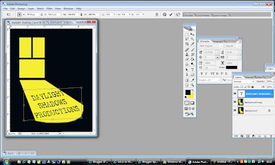

This was the final and only version of the "Kaleidoscope Pictures logo I created. I like it because I think it's simple, but effective. I searched Google Images for an image of an image made by a kaleidoscope and inserted it behing the text in Photoshop. I then erased the area around the letter, leaving the image only inside the two o's.
No comments:
Post a Comment