Saturday, 7 August 2010

Animatic


* Dialogue and sound effects will be added in the actual product, however, I couldn't put these in the animatic as I hadn't filmed/recorded them yet.
I found timing the soundtrack to the footage really hard and I think this comes across when you watch it, however I hope to improve this when I make the actual trailer. It also is apparent that I'm not very steady-handed, and so will need to practice with a tripod, or just practice filimg before it comes to the shooting dates. I used Final Cut Pro to create the animatic, and although I found the outcome a little disappointing, I had never used the programme before, so found the practice invaluable.

Wednesday, 4 August 2010

Flatplans

After doing the storyboard, I had a good idea of what I would like to do for the film poster. I really liked the opening sequence, where we see a close up of the characters face looking up towards the camera. Not only does this directly link to the trailer, but it also seems imposing like you're looking down on him or as though he is looking up distressed. The angle links to "Rise" literally and makes him look sort of like he is in pain mentally, which I wanted. It's bold and close up so that the audience can't look anywhere else. I thought this, with the film title in a large and bold font would look really good, especially if I kept to the grey scale palette. The greyscale colour scheme reflects the 1960's and also suggests a lack of colour; much like the emotional struggle for the main character and I also think it will add a gritty edge. The only problem was whether or not to have the eyes open or closed on it. To solve this problem, I drew out the poster plan with the eyes open and attached a small cut-out of paper with the eyes closed on, which I could stick on top to compare outcomes to see which one I preferred. However, due to an indecisive nature I decided that it was probably best to gain answer from my target audience, not only because they could decide for me, but also because it is pointless picking something my audience will not like as I am making my product for them. Below are the two alternate versions:

I also had a problem to overcome with the credits at the bottom, as I hadn't actually closely identified who or what was credited here. Here are some sections of other film posters that I used to help me when identifying the content.


From looking at examples of film poster credits, I learned that the main components are production companies, which have their logos repeated underneath, actors/actresses, screenplay writer, producer, soundtrack producer, costume designer, special effects designer, director, release date and possibly a website for the film. I tried to include these elements in my plan, but it was quite hard to fit it all in, however, I will definitely include these components (apart from irrelevant roles such as special effects designer) in my final product.

I am quite pleased with the plan for my film poster, and I think if it is in grey scale it will perfectly reflect the mood and real-to-life look I want my products to achieve. After asking people that I know, who are in my target audience, I realised that the main consensus was to create the poster with the eyes closed, as people said it looked more mysterious, emotion-filled, or just more interesting.

After completing this plan, I moved on to planning out my film magazine cover. Unlike the film poster, I didn't really know what I wanted it to look like. I wanted something that would reflect all of the elements that I want to achieve. I knew I wanted to take the idea from "Little White Lies" of graphics and the idea of creating an edition of a magazine which is based on just one film, which takes up the entire front cover. I made a couple of rough plans to see what I might like to do. (Shown below).

However, all the rough plans that I made either seemed a bit restrictive, conventional or hard to achieve. (For example drawings/photos of reflections). I still wanted something different to conventional magazines, and I felt like I was still focusing on "Little White Lies" and trying to get as close to this as possible, which wasn't something I wanted to do as I wanted something original. So, I thought about the different themes in the film idea, and how I could incorporate these into one image. The ideas of nostalgia, modern day, emotions and coming of age seemed to fit together in speech, but not visually, as they seem like a bit of a "mis-match" and disintegrated. This is when I came up with the idea of a collage. I thought that if I had a grey scale image of my character's face (to keep the continuation of grey scale between products) then I could collage records, text; both well-known and my characters, scenery from the trailer and other views of my character on top. I thought this would also portray the mix of ideas in the film as well as the disintegrated situation the character finds himself in. This would not only reference the past with the images used, but it could also display the theme of nostalgia in the actual processes of manufacture, as it will be done by hand and then scanned in, rather than done entirely using modern technology. I could also collage other pictures of my character into it, so it became reminiscent of The Beatles' "Revolver" album cover. I really likes this idea, and below is the annotated flat plan I came up with.

I really liked the diagonal line that the face creates, because it looks a bit like a literal metaphor for the title of the film, "Rise." I came up with the idea of filling the space that this left with scanned in pages of the character's notebook seen in the trailer, or photocopied pages from it, to add another process. The masthead is the outline of my writing, adding the the hand-made look, whilst adding a bit of a modern twist as I hope to recreate this in photoshop in the actual manufacture. It's hard to visualise what it will look like from the flat-plan because it just contains outlines compared to what the actual one will hopefully look like. The dimensions for this is height - 24.4cm and width - 19.6cm, which is smaller than A4 and what I wanted. Throughout the making of flat-plans, I have begun to write the title of the film "Rise" with a full-stop afterwards; "Rise." This looks like a kind of literal contradiction and shows the struggle of emotions for the character as his "rise" is stopped or cut short. This emotional struggle is typical of gritty dramas, which often focus on this subject.


Below is a photo of me working on my final magazine cover flat-plan.

Storyboarding

When it came to the process of storyboarding, I decided that the trailer would have more impact if it was all in grey scale, apart from the institutional logos. I thought this would have more impact and make it look more gritty. I found the timing of shots and some of the content quite hard to decide on. I don't doubt that it will change slightly when I actually come to make it, but I'm quite pleased with my storyboards. I think the cinematography element of it portrays the mundanity and frustration of reality and loneliness of adolescence quite well, but I think the message will become clearer when I decide on and write out the monologues, which I hope will act as text explaining the narrative does for other trailers.

I'm really happy with the first scene in the film and I like the possible symbolism with the eyes opening and closing throughout the film, which could suggest new beginnings, realisation or acceptance. After doing the first scene in the carpark however, I didn't really know where to go with the trailer, because I didn't want it to move too slowly as it might end up as a film opening rather than a trailer. To overcome this, I made a list of locations and scenes that could portray the message and character that I wanted to, which helped me to storyboard it out. I also found it quite hard to cut it down, because at the moment it looks as though it will last just over 2 minutes, which might be a bit long, but I wanted enough time for the soundtrack/music to get going and give the footage some direction or mood.


I decided to display the title by flashing each consecutive letter inbetween fast and varied shots. I thought this would not only create a crescendo or "peak" effect, but I thought it could also be reminiscent of 60's/retro films, especially when mixed with a retro soundtrack. I wanted this section to be big and bold, with the letters spanning the whole shot in black and white, which could contrast with the slightly softer ending. The ending contains more long shots aswell, which is different to the close ups and extreme close ups in the section. I tried to use these to portray the frustration and changing emotions which are typical to a coming of age film, whilst also being more "brutal" and physically portraying difficulties in extreme close ups, so that the audience has to face them too, and this is something that I don't think you see in a lot of films in this genre.


Monday, 26 July 2010

Construction of Institutional Logos

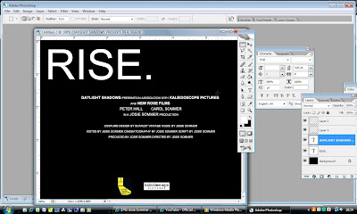
I created the institutional logos using Photoshop and I made them to the dimensions of 720 pixels X 576 pixels at 72DPI . I did this because it was a compatible size with the trailer I was making, so that hopefully it wouldn't pixelate, or be too big to insert. Below are screen shots showing the production of the end credits for my trailer. I found it quite hard to pad this out because in a real trailer there would be more names to list for each job role, but I thought it would look silly if I repeated my own name too many times. I created this frame after beginning the production on my trailer, so that I could pick a font that would be in-keeping with it, to create the idea of continuation. I eventually decided to use the font of Arial, because it is simple, bold and effective. I did worry that it might look a bit dull, but then I want my trailer to be simple and show the frustrations of being young, so I thought something like that would work; not to be dull, but to be bold.
This was the first layout that I had for the frame, but the lack of text in the frame made it seem too sparse, and it was a bit of an unconventional layout for a credit frame, so I moved the title of the film from the top to centre (as shown below), and I used the guides to line it up in the centre.


Below is the finished frame.
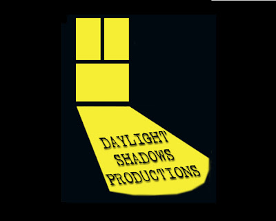
At first, I found this process quite hard because I hadn't used the software for a while and I really liked the flatplan designs I made of the logos, and I didn't think they would look anywhere near as good when the "handmade" element/effect was taken away. This thought especially applied to the "Daylight Shadows" logo. Below is a shot of my first attempt of the logo. I found it really hard to get the text how I wanted it to look and it looked too altered and fake. So, in an effort to overcome this problem, I went back to the scanned in image I had when designing the logos to see if I could create a logo from this image.


This was the outcome for the second attempt. I much preferred the simpler colour scheme and the lack of fancy effects that I think improved upon my first try. However, it still felt abit static and dull. So, I tried moving the logo about I found the result was more aesthetically pleasing.

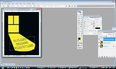
This was the final version that I am happy with. I achieved the angle that the text is on using the "skew" tool in photoshop (pictured below) and I added the effect of a drop shadow (shown below) to make the image look a bit more 3-D and not completely static. I know that the logo isn't very exciting or full of effects, but I like the simplicity about it, because most independent film logos are just flat image with text, so I think mine would fit in if it were to be made into a real logo.(Drop shadow effect)


(Skew tool)


This was the final and only version of the "Kaleidoscope Pictures logo I created. I like it because I think it's simple, but effective. I searched Google Images for an image of an image made by a kaleidoscope and inserted it behing the text in Photoshop. I then erased the area around the letter, leaving the image only inside the two o's.

Institutional Logos

These are some rough sketches of different ideas for institutional logos. I only really wanted to use 3 in my trailer because I noticed that there are only usually 3 shown in the other trailers I researched.


After doing some rough sketches, I made my two favourite logos larger and in a bit more detail. I wanted something that would fit in against a black background and look professional as I thought some of my ideas looked somewhat cheesy. I also wanted something that wouldn't be extremely difficult to construct when making my products. "Daylight Shadows Productions", "Kaleidoscope Pictures" and "New Rose films" are the ideas I went with because I thought they achieved my goals and I thought they looked quite independent and believable.


This would be a distribution logo, and "New Rose Films" would be a financier's logo.

"Rise" is the title of my film. I didn't want a complicated title, just something big, bold and simple to contrast with the idea of the film. The only real detail is that the letters are slightly unevenly spaced, which is deliberate and I like.
The release date (below) is a logo that is in the same kind of font as the title. This is because these two things are commonly in the same font, and it creates continuity. I have chosen the release date to be November 19th because this is a Friday and most films are released on a Friday, I also hope to have completed my productions by then. However, if I haven't I will change this during production, keeping the same font.


Sunday, 25 July 2010

Sourcing Soundtrack


After deciding which tracks I wanted to use, I researched the addresses of the record labels, so that I could send a permission letter to them. I found this quite hard as some labels (like Factory Records) don't exist anymore and there seems to be a very time-consuming trail to who the current copyright holders are. After taking a long time doing this and not really getting very far I realised that the copyright holders are on the back of the actual CD's/records, which, seeing as I posessed all but one, made the process alot easier. Below are screenshots of each of the letters I sent. I was quite suprised at the number of American labels with British artists on, but I'm not sure how many will allow me to use their songs as I imagine it is of much more benefit to them to say yes to someone who will use their track in a large scale film as it would be a good form of promotion.

I tried to pick songs thats rights were held by someone who might let me use them. Some music that I would have loved to have used and that would have fit in well, like The Beatles, weren't even a consideration really because they are very tight with their permissions and don't need to appear in soundtracks to boost popularity as they are already so popular. I know this because the film "The Boat That Rocked" tried to use their music but Apple denied them permission.


Below is a scanned in copy of a letter once I had printed it. This shows that I left a gap to sign each letter, which I thought was the professional thing to do.
Below is a photo of the letters in their envelopes before I sent them off.

Wednesday 1st September - I didn't receive any replies to these letters for the two months after I sent them, so I decided to use the music I had planned to anyway because I will have to assume that they deem project unimportant or insignificant enough that it does not require a response or pose a threat to the copyright element of the music.

Researching Eras

This is a scan of a chart I used when I went to York to ask 30 trendies between the ages of 15 and 24 which era they were most interested in, to see what look I should have in my film. The end result showed that the 1960's is most popular, so this is what era I will include in my products.


Wednesday, 12 May 2010

Proposal of Ideas

This is a scan of a spider diagram that I made to help me come up with some ideas for a storyline for my products. I wanted to think of something that would hopefully be quite unique and challenging to do, that would be different from the majority of things that are available for 15-24 year old's in the C1 socio-economic group. To think of something that would do this, I tried to think of something that people would be able to relate to, but still find new. I thought about a few products that appeal to trendies and I thought of books like "The Catcher in the Rye" and "Absolute Beginners". The things that these products have in common is that they are about thoughts and feelings of young people and begin to reveal their insecurities. I then thought about "Nowhere Boy" and "Control" which appeal to my target audience with a strong musical thread and a strong thread of nostalgia. So, I thought it might be a good idea to think of something to incorporate all of these factors. I thought a reality-based, gritty drama about trying to be different and interested in past era's, and trying to make something new whilst pulling away from the norm may be good. Then I thought about the insecurities of growing up and the feeling of loneliness, which I think everyone can relate to. Since starting college I have noticed a general unspoken peer pressure on people to get drunk and go "out on the town". I've also noticed the pressure to be "one of the gang" and not dull. Personally, I think this pressure is a bit childish, so I thought that it would be good if my products had a deeper meaning, and I could try to break down this boundary. There's a stereotype that someone who is a loner is "uncool" and not desirable (or that is the impression I get). But I think there are a lot of young people with ideas and attitudes that they haven't got in common with anyone, or haven't found anyone to connect with. So, I've decided to make my film about someone who maybe is lonely or a loner, but who is very interesting, with inspiring ideas, attitudes and thoughts. In a way, this is kind of the "anti-thesis" of Hollywood blockbusters; there may be no happy endings and I'm trying to make it look entirely reasonable and plausible.

Whilst incorporating these ideas, I really like the look of older, iconic films. Books like "The Catcher in The Rye" and "Absolute Beginners" are like cult icons, which I would love my film to be like. I would like some of my film trailer to be filmed in grey scale like "Control". I think this gives the film a more edgy and gritty look, enhancing the storyline. However, I'm not entirely sure yet as to whether all of the film will be in grey scale, or just bits. I really like the film "If..." which is a kind of mix of colour and black and white cinematography, so maybe that could work or be a possibility. This made me think about the subject of nostalgia again. I plan to research which era appeals most to my target audience and to try and recreate this look within the character. It would be too hard to recreate the past in locations, so I thought that I could use music and costume and grey scale cinematography to create this feeling as the past is something that you think about as a young person and seems strangely appealing. However, using modern locations and old clothes will make the character be in contrast to his surroundings, which is what I want the film to be about, and his individual thoughts being different to most peoples. This element could also link in with the "individual" character as quite a few of music legends have been sad or on their own, and most music legends have been individuals; Nick Drake, Ian Curtis, Syd Barrett, John Lydon, Bob Dylan etc - (Music has a massive draw/appeal to my target audience). I could also bring in the "coming of age" element with the character having to come to terms with growing up, getting a job and daily mundanity. Because of all of the ideas I want the film to include, I have decided to call it "Rise" as it has lots of connotations and suggests a posotive movement for the main character. (It has been taken from the Public Image song, and I would like my character to be abit of a modern day John Lydon type, so it fits in.)

However, I have to consider what I have available to me in terms of resources. For example, I don't know of many friends who would be willing to star in my trailer. Because of this, I researched films without a large cast;
http://www.youtube.com/watch?v=twuScTcDP_Q

"Moon" has a narrative thread running through it about loneliness and the stark landscapes and lack of other characters really hit home this idea, which I really liked. This made me think that perhaps having this lack of resources may not be a disadvantage. I thought it would be very hard to make something like this not look boring, but it may be fun to try. Obviously, there won't just be one person in every scene of the trailer, but I would really like to do this in atleast a couple of scenes.

I decided to make the main character male, because most of the main characters in the films I looked at during my secondary research are and this is obviously a structure that works. It will also probably have more of an effect as there are still media stereotypes which put pressure on men to not cry and be "hard", whereas women are always in touch with their emotions. I think it will be interesting to try and subvert this view within what would be a whole film if I were to really make it.

In the trailer, this narrative will be structured by an initial voiceover monologue by the main character, which will "set the scene", and then the sound will change into a music soundtrack. It will be non-linear and flit back and forth throught the storyline, with faster edits to reflect happier times and slower edits to reflect sadness. I think it will be fast at first, after the scene is set, and then it will gradually become slower and more heartfelt. I could even film some teenagers drinking or at a party, doing what "stereotypical" teenagers do in like a "Skins" fashion, and then slow the footage down when it comes to my character and what it is actually like to be young. I want to use different songs to reflect this. I think it would be good for some shots in the trailer to be of writing to help reveal the narrative, and the bulk to the credits will be at the end, with a few institutional logos at the beginning. (I still want to make my products be produced by independent institutions). I am really interested in art videos where everything is unconventional and distorted, so I think this could be interesting to experiment with when producing the film. It may be safer to stick to conventions for the majority of the film as an art film might not be very successful in the cinema, but it would give me the opportunity to make something new and invigorating, which I would love.

I will make the film poster and film magazine cover only contain my main character; continuing the solitude, and I think I will make them in both greyscale and colour (if this is what I eventually do in the trailer). I would like them to look quite rough and edgy. I think I would like to make my film poster be mainly a photograph of my character looking isolated on location at somewhere which they will be filmed in. I would like the title to span beneath where the character is pictured and be in a rough font. The logos and credits that I will use will be along the very bottom in a small font. (Despite these ideas, I find it quite hard to propose the ideas for the film poster without making flat plans which I will do soon.) However, I still want to change the typical conventions, so the photo could be an extreme close up of the main characters face to make it look imposing and really personal. If the film poster was to be made really, it would probably be A1 sized, but I wouldn't want it to be glossy, I would want it to have a matt finish, to make it look more raw and gritty, this would probably fit my small budget as well as being what I want.

I want my magazine cover to be quite arty, and so I might refer back to old magazine covers (inkeeping with the retro theme) and make on that looks like it has been "cut and pasted". So, I would like it to have a matt finish, rather than a glossy one, like the poster, making it look a bit retro and gritty. I also like the effect of old magazines where everything appears to be printed on a paper that looks as though it's yellowing, which I would like to incorporate. The title of my film magazine will be "Studio 28", which is a cinema in Paris. I think it sounds quite "cool" and very different from magazine titles like "TotalFilm", which will appeal to my target audience who like things that aren't mainstream. It's also a kind of spin on "Studio 54" (Andy Warhol's studio), as I want it to look really arty and appealing. I doubt it will be covered in sell lines and typical conventions because I want it to be minimal and reflect the isolation of the film as effectively as "Little White Lies" does. I don't want the size of the magazine to be A4, as I want it to be different, so I would like it to be smaller in both width and height by about 2 or 3 centimetres.

Institutional Context

FILM PRODUCTION

I've taken the following pictures from http://www.skillset.org/film/business/ which show the process of film production and the different roles within them.


The first section of making a film production is to have an idea, which is sourced from any kind of inspiration. In my case, or the case of most dramas, the inspiration would be real life events and feelings. Then a producer, director and writer are found. In my production, I will be acting in all of these roles. This means that I'll have to make a script, direct the scenes in the trailer and source funds. However, in my case, I won't really need large funding as it will be small scale, and would probably be produced by an independent company rather than a Hollywood organisation if it were to be really produced. This would effect the look of my film, as independent institutions such as "Film4" or "3 Dogs and a Pony" seem to focus more on the uniqueness of shots and gritty feel of the dramas they produce. The treatment comes next in the process, which is a plan or proposal of what the plot and basics of the film will be.


If the trailer were to really be produced, the proposal would be pitched to different production companies to try and get them "on board" to invest time, money and services into the production of the film. In the real world, this pitching to different companies could take a vast amount of time, with people waiting years for their script to be accepted. In my own production, I obviously won't have this problem because I won't have companies or backing. The last stage in the diagram is "tying down a writer". This will obviously be me, so I won't really have this problem.

The development/production of a script is something which begins with a general idea or brief synopsis of the plot. Once this synopsis is "achieved" there needs to be an outline of the plot or storyline, breaking it down into different sections or phases. This contributes to the act of beginning to draft out a script. In my case, I won't need to draft out whole scripts for the whole film, as I am only making a trailer. So, instead I need to map out the important parts of the storyline or the parts that I consider to be most attractive to entice audiences to view the actual film. This may be snippets of dialogue or a monologue. I will probably need to come up with more sections of script than I will actually need, so that I can have a good proportion of material to edit down when it comes to editing my film trailer.

This section of the production process is labelled "packaging". This refers to putting the film into a ready commercial package which can be properly presented, with a rough budget. A part of this phase can include casting or appealing to big stars to make the proposition of your film more appealing to commercial companies, as big stars encourage wider and larger audiences, meaning a larger turnover. Packaging also includes the production of more detailed budgets and pricing, as well as a schedule to inform possible participants of the durations of production. All of these components create the package of the film. However, I won't need to present my film trailer as a package to commercial companies. I would like it to look commercial or professional, but I won't need to present it to anyone, it will be for my own information. I can still make budgets and schedules, but it seems a little surplus to requirements to create a proper budget when I will have limited funds anyway.

This section of the process is about financing. For the film to be produced it needs funds from investors. If my film were to be actually made, I think it would be probably funded by public investment (organisations like the UK Film Council) or it could possibly be co-funded by organisations. However, the latter may not be so likely as it probably wouldn't have a large budget, so wouldn't require funding from multiple organisations. There are also various other sources for money, such as banks, selling the rights before production, selling shares and having wealthy contacts. Once the appropriate funding has been negotiated the film production can properly begin.

Pre-production involves casting for actors to play the roles in the film. It's important when casting to consider actors who are not only right in appearance, but also in ability. In a proper film production, possible actors may be recruited nationwide, whereas in my production I will be limited in choice. It may also be difficult to gain a range of ages in my casting and so I may have to work in reverse, shaping the storyline around available actors, or at least take this into consideration when making a script. The casting section will probably be the only real involvement of other people in the production of the trailer, otherwise I take on most roles. After casting, a storyboard will be created with directions and technical codes deeply annotated in it. There will also be a professional artist drawing the pictures. I will be making a storyboard and animatic for my own trailer, again taking on all of the roles involved. In the pre-production stage, I will also have to source costumes and make-up that I will need for the production. As I don't have a large budget, these elements will probably be purchased from charity or second-hand shops. I will also make any alterations to costumes that are necessary in this section. In addition to this, I will need to prepare any locations, which I should have already visited and checked that I am able to film there.

The production phase is where the actual filming will take place. During this section, I will be taking on the roles of setting up and providing props, shooting the actual footage, director, cameraman, sound man, lighting technician, producer etc. The only roles I will not be performing are that of the cast and I will try to ask someone to take stills shots of the production and action as it is ongoing. During this section, it seems important to stick to a schedule and to the storyboard. If it were a proper production, roles would be applied to many different people and other people such as insurers and "gaffers" would be there, but as I am producing it myself, on a small scale, with no funding, I will have to perform most roles.

After the footage has been filmed, it would be time for the post-production section. This is when the footage is edited together to form the narrative. Sound would also be incorporated, which can include dialogue, music, voiceovers and a diegetic soundtrack. Titles, logos and credits will also need to be incorporated accordingly. I will probably do this on the facilities and software available at college or home, whereas really people can hire out editing suites/studios and have state of the art technology. However, this may be less likely in an independent film, which mine would be, but obviously mine will not be of such high standard or quality. When all of this is completed, there eventually be a final cut.

This is the stage which seems most relevant to my project. This is when a trailer would be created for a film, and used for advertising. This is also when the product would be sold and screened at different venues. Deals will also be negotiated with distributers, who could possibly distribute the film nationwide or internationally, depending on the target market.

This stage introduces the possibility for synergy or synchronisation of products. This is when a film poster would be created, which I also have to create. This is also when other merchandise is created, and this can range from anything to hats, mugs, t-shirts and toys, depending on the audience. (For example, toys would be pointless for a film with a target market of adults ages 45-70). Also, surveys and tests are done at screenings now to see who the actual audience is, and who the film is most attractive to. This information enables people to market the product effectively in effective locations at effective times. (For example, a TV advert on in the advert break of Big Brother for a film aimed at 14-22 year olds). The only section of this I will be really focusing on is a film poster and magazine cover, as it will be advertised in film magazines as well.

This is when the film is actually exhibited. Independent films are more likely to be shown at smaller venues as they attract a niche market, whereas Hollywood blockbusters can be shown at nationwide, larger cinemas like "Odeon".

This is when merchandising can add to the vast profits made; DVDs and Blue Ray discs are produced and sold, the film can be sold to hospitality organisations, games can be made, other gimmicky products can be made and it can be screened on television. There is always the possibility of making more capital from the film as remakes may be made in the future as the love for a film can be passed down through generations.

PRINT.

As well as making a film trailer, I will also be making a film magazine cover and a film poster, both of which would be produced by the print industry. The type of organisation that would probably create a film magazine like I want to create (similar to "Little White Lies") is an independent company. An independent company like this is smaller than institutions that create magazines like "Total Film". Because of this, the production funds that the magazine has to go on may be smaller and the actual content of the magazine may differ. For example, "Total Film" may cover/report on international film festivals and interview huge stars, whereas a smaller magazine like "Little White Lies" may be based on more independent films (like my own would be) and still cover big film festivals, but in a different manner, focusing on different aspects. Being an independent institution may also mean that funds are smaller, in which case the production value may be lowered, or the distribution not as wide, or not as many editions published. If my magazine were to be actually created, I think I would like the lack of funds to effect the look of the magazine. I quite like the "rough and ready" look that a lot of early punk magazines had, where there was no technology and the magazine was compiled by cutting and pasting pieces of paper and pictures. I won't be assembling my magazine like this, but the "rough and ready" look is something that is commonplace to a lot of independent magazines, whether they belong to the film genre or not. I think magazines like "Little White Lies" are so appealing because they do look so different and therefore attract an audience similar to the one I intend to be aiming at. However, if my magazine didn't have a glossy finish, but was still quite "rough yet arty" in look, I think it would still appeal to and attract the same audience, whilst lowering theoretical costs. I would like to apply this look to the film poster, as I think an independent print company would also be creating this.

In the print industry, the process begins with an idea, like the film industry. The idea is then planned and drafted until it is produced or created on a computer. This is then printed by a printing company, and distributed accordingly. In the case of my own productions, posters and magazines would probably be produced on a low budget. I will be taking on all of the roles in these productions, such as editor, artist, printer, researcher, writer, proofreader and illustrator, with the help of modern technology. The only roles that I will not be taking on will be being the subject matter (models in photos). The technology I will be using will be operated by me, such as digital cameras, film cameras, Adobe Photoshop etc. This will not be at any real cost because I can use these things free with college. So, I will need to have various skills such as editing skills, photography skills and filming skills.

In the actual industry, my film poster wouldn't be very widely distributed, and I could probably only afford to place them where I knew my target audience would be, such as in areas of cities where vintage shops and record shops are. I would probably have to conduct surveys of where would be the optimum place to put posters. In most cases, film posters are manufactured by the film distribution company, just as the trailer is, possibly using shots/fonts used within the trailer, which they will have most knowledge and control over - they will also know what they want the look of the package as a whole to be, and so will best execute this idea. My film poster, if it were to be made properly, would be distributed and made by the institutions involved in making the film/trailer. With reference to the film magazine cover I will be making, I think if the magazine were really produced it would be distributed to smaller more independent shops in cities, such as vintage shops and record shops where my audience would be known to visit. Although, "Little White Lies" is exhibited in a large retailer like "WH Smiths" and there are never many copies held there, so I think it might be distributed shops as well. An outlet like "Borders" would have probably been ideal to get a large number of sales, as it stocked a wide variety of independent magazines, but due to the credit crunch it has sold down.