Wednesday, 11 August 2010

Skills Development

This is the second cut of the promo video. I have inserted the institutional logos that I made into the start of the video, and inserted small pieces of text during the video when people are talking. I also used the transitions options to create fade-ins and fade-outs. I was suprised at how easy this seemed and I learnt a lot of techniques during the production; such as how to move many things along a timeline at once, and how to alter texts and where they sit in a frame.

This is a short video that I made using Final Cut Express and footage that I had not captured, but which we were given to make into a promo film for the media department at college. I found the editing of the footage quite a fun process, and I took it as an opporunity to play around with different effects like reversing shots, slowing shots down, changing the opacity of a shot and fade outs. We also had to make our own soundtrack using Garageband, which I wasn't really very good at using, but I think it adds a bit of depth to the video anyway. I didn't manage to make to make the sountrack come in and out smoothly, which I think is something I will need to pay attention to when making my own trailer. However, thankfully, I will be using songs which already exist, so I my lack of Garageband skills won't effect the quality of my trailer, and I will also have a much longer time scale to create my own product, which will hopefully mean that I can pay more attention to details such as music timing and smooth sound editing. Despite the fact that I wasn't massively pleased with the outcome, I really enjoyed the task and I think I learnt a lot during the process of completing it.

Visit to Teesside University - Monday 6th September


During the visit, we had a chance to use professional cameras (above), and were shown all the different features that these had. It was really useful and informative, giving many helpful tips, such as how to use the tripods, the different of microphones. The latter is something that I hadn't really considered, but is something that I am now aware of, as I want to use diegetic sound effects and monologues in my production. I also learned how to achieve focus the picture, change the lighting levels and achieve a smooth shot. It was a good opportunity to practice filming shots that I want to use in my trailer, such as different distance shots and framing.


We spent the other half of the visit working with Final Cut Pro (above) and were shown how to use the editing facilities that the program holds. I had never used this software before, apart from to create the animatic, so this gave me the opportunity to practice and use the different tools in the program. I learnt how to change the volume levels in the soundtrack and how to slice up footage and move different sequences/shots around. I also found out how to change the speed of shots and was told that footage can be transferred into greyscale (which is what I want my trailer to be in).


I began to start taking photos in the style I want my stills to be for the magazine front cover and film poster:
I needed to practice getting the angles and distances right, something which I didn't really achieve in terms of angles in the photo above.
With this shot, I achieved the right angle and distance for the photo for my film magazine cover. I also liked the shadows it created, both on and off the face, and this got me thinking about shadow in the cover I have planned to make - what I have planned is a bit 2 -D in terms of cutting and pasting things on to a photograph. However, if the photo contains shadows, it could give it some depth and improve it.
I initially found it hard to get high enough to take a decent shot and still be able to see what I was actually taking a photo of. It was also hard to do this without obstructing the light source.
After I found out how to do this, I experimented with closer shots, and shots that were further away. I liked this shot, but I thought it was too much of a close up when compared with the plans I made earlier.


I really liked this shot, but I was a bit annoyed that it wasn't in the centre, which I think is something I need to practice before the actual shooting days. However, if it was the real shot, I would probably cut it down a bit once I had found the right angle and height to take the image from.


As part of my skills development, I analysed a film trailer and tried to recreate it in stills. This helped me improve/discover what I need to improve; such as photography and logo creation. It also helped me to realise the scale of such a project as a film trailer.

Scripts


Here is a screenshot of the script. I found it very difficult to write without sounding pretentious or cringey. I tried to minimise these factors and keep each section in keeping with when it will be in the trailer, so that the footage can be used to unravel subjects like that of fashion and music that I didn't know how to incorporate into the script. I may have to lengthen these monologues however, depending on how long they go on for in the trailer itself.

However, I think that when it actually comes to the filming that I will discuss what I've written so far with my main actor and see what he thinks of it, as he is in my target audience. This way, I will be able to bounce my ideas off someone to get a useful response and hopefully improve it along the way. Also, he might be able to advise me and improve/ add bits to what I have written.

Monday, 9 August 2010

Call Sheets and Model Release Forms

The people that I created call sheets for are John Newton, Carol Sommer, David Stobart, Hannah Robinson and Chris Munden. Here are screen shots of 3 out of 5 call sheets I have constructed for the characters I will need to be played in my film trailer and other productions.
As well as call sheets, I also made model release forms, to ensure that I had the models' permission to use their image and broadcast it on youtube and blogger/ the internet. Below are examples of one of the model release forms:

Photoshoot Plans

I made photoshoot plans for the shots I needed for my film magazine cover and film poster. Below is the plan for the film poster:
This is the photoshoot plan for the film magazine cover:

Both of these shots will be out in the open, so the light source will be the sun (natural light) and this will probably be low key for the majority of the film trailer. For the second shot this should be fine because it is so open, as it's in a field, but for the first shot there may not be enough light and it might be too dark. If this is the case, I may be able to shoot it on the top floor (the roof) of the car park, which will be out in the open and give me enough light. This could also make it look higher up and make the shot look altogether more imposing. As both shots are close-ups, I will have to make sure that I am not blocking the light so that I don't cause a direct shadow on my subject's face.

Recce

Streets.
This is the road perpendicular to the one that the sixth form college is situated on. I want to use streets in the shot where my main subject will be shouted at by other teenagers. I think this street gives a good perspective and will allow me to include the main character walking past and the other people in the background. Also, because it is so close to college it will create a physical barrier between people of the same ages and my character, showing that even in a place where other people are the same age, he still feels isolated.
These images (above and below) are of some streets in the surrounding area. They are quite "safe" and the people who live there are most likely middle class - which will connect with my target audience. Again, these streets could create a seperation, as the character is in a safe area, but still feels lonely and is verbally attacked by other teenagers. I am allowed to film on these streets, as they are out in the public and I don't think there will be much traffic here as it's quite a residential area.

House interior.
This is the front room of the house I am going to film in. You can see from this photo, and the following ones, that it already has most of the props I will need, in terms of books, CDs and records, so there will hopefully be no major expense there. It has quite a modern design, but most of the indoor shots are close up, so this shouldn't matter too much.

This could be where the main chracter sits to read.

This room also contains a record player, which will be useful for the shots I need to take of the main character putting on records.

This is the bedroom that I am going to use for filming in, I think it will look quite good in grey scale, and this will be used as the setting for when the main chracter dresses and dances. On the wall next to the bed is a collage of posters, pictures and odd things that I found to do with music and with a special reference to music of past decades. This could help to portray the obsession with nostalgia, as well as the costume and look that my character will have.

However, the wall paper at the end of the bed doesn't really fit in, and I would have preferred something plain, so maybe I could tack up a roll of plain paper to make it look more dull and harsh. If I did this, it would also give me a good background to film the dancing against.
This will be the view from the top of the stairs that I need where the main character's mother shouts up the stairs. There seems to be enough light, but I like the way the light decreases towards the top of the stairs, which I think will look quite good in grey scale. There are some photos hanging on the wall on the way up the stairs, but I can take these down when it comes to filming.This is the hall of the house, where there will be a shot of the door closing behind the mother after she has left. Again, I think there is good light, and I do have permission to film here.

Car Park.
This is the car park which I have requested permission to film in, which I need to use for the opening of my trailer. I am currently waiting for a reply to this request and so will wait to see if I can take photos of the interior. Although, it hasn't got the wide and vast windows I was hoping to get, I think there is a third floor on the roof which I could film on instead and it would give me the high angle view that I am hoping for, to get a view of some other buildings.
It is situated just on the outside of the town centre, so there should be some good views from there, however, it is still not as high as I would have hoped. I will wait to see if I get a reply though before looking elsewhere. Because it is situated on the outskirts of town, it is the furthest away location that I have chosen so far, but even then, it is about a 5 minute walk away from the rest of the locations I want to use, meaning I will hopefully have more time to film in each place.

Field.
This is a disused football pitch, which has become overgrown and rough looking. I think it has the perfect gritty image for my film, and again, there are no permission or access problems. I think it will look good for the shots of the main character spinning amongst high grass, and there is a platform to the side of it, so I could take some long distance, high-angle shots, which I think would look great. It's also very close to the South Park, as is the house I am using. This will save time and costs for travelling and will hopefully mean I have more time to shoot at each place.
Back Alleys.

Round the back of and near to the house that I am going to film in, there are a lot of back alleys which will be perfect to film in as they stretch on for a long way and look worn down. There are also blocked up/bricked up windows and doors around the edge of the actual alley, which could represent the past being covered up or not noticed by most people, which would work well for my film trailer. The whole look is gritty and run down, which I really like.
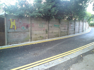
Next to the field I want to use is a back lane called Polam Lane (below), which used to be a cobbled alley and I really wanted to use. However, when I went to take these photos for my recce, I discovered that it had been tarmacked over and made into a proper road. At first I really didn't like this and I thought that the look I wanted had been ruined, but it still has the same kind of metaphor of the blocked up doorways in the back alleys, where the past and memories are covered up, which made me quite like it. I also thought that the newly painted yellow lines on the tarmack would really stand out when I was filming in greyscale, making it seem like the character is walking down a pre-determined track that he cannot escape.
It also contains the gradual slope that I wanted to film the character going up and then down, so's to make his situation look a bit futile, pointless and mundane. So, I think I will film here after all.

Park.This is a view from the inside of the South Park. It's open to the public and there should be no problems with access and filming. To the left of the picture you can more or less see a string of benches with their back to the river, but facing the field. (One bench pictured below). I think that these benches, in quite a picturesque surrounding will look good for the shots I need in the trailer, in which my character is sat on a bench writing.
Also, because of all the trees and nature around, it will be the perfect place to get the shots of trees and leaves rustling (as pictured below).

Costume and Props


Costume.
The first half of this video sums up how and why I want my character to dress. I think the 1960's was a time of change and rebellion compared to the previous decades that were home to generations still brought down by the aftermath of the war. 1960's clothes is about difference, thinking for yourself and being a somebody. I think this both matches and contradicts my character because he is an individual and is a somebody, but in doing this, he possibly becomes a nobody to everyone else his age. I really like this link to the past, but I don't think it is clear enough in my products so far, so I think when it comes to writing the scripts that I will have to explain this is in the monologue's he says.

On Thursday 12th September, I took my main actor shopping in Durham, to visit the vintage shops to buy clothing for the retro/60s look I wanted him to have. We went to Durham because I know of some shops that are reasonably priced and it isn't too expensive to get there. This is the place I planned to go : http://www.scarlet-ribbons.co.uk/contact_us.php

This is a photo of the interior, although sadly it isn't very clear.

This top is really mod/60s looking, which I was really pleased with and I think it looks nice. When we actually got into "Scarlet Ribbons", there wasn't as good a selection as I had remembered, and the only things that looked good were things based around a polo shirt design. We got the top above and the one below, which my actor will wear with black straight leg jeans and plimsoles.

Notebook.

This is the notebook that the main character will be seen writing in throughout the film trailer. It originally had a vibrant cover, which I backed in brown paper because I thought it reflected the mood of the film better/ more. Inside the notebook I wanted it to look like a scrap book and quite arty, with a mixture of pictures, newspaper clippings and writing. I began doing this roughly (as can be seen below). I will eventually ask my actor to write down the monologues in it for one shot in the film trailer and I think it looks quite good.

Permissions For Locations

Before doing my "recce of location", I thought I should first request permission to be able to film where I want to. Most of the locations are in public places, which should be fine, however, the opening sequence of my trailer is in a car park and I will need permission to shoot here. So, I decided it would be best to ask for permission sooner, rather than later when it may be too late. Here is a screenshot of a letter that I sent to the manager of the Cornmill Centre in Darlington, which has a carpark which should give me a good view of the rooftops and roads in town.
I will wait for a reply, and contact more directly if there doesn't seem to be one. If I am not allowed to film here, I will obviously have to request permission to film somewhere else suitable.

(26th August)


This is a letter of reply that I recieved. After phoning up the manager, as requested in the letter, she confirmed that I would be able to film in this location at a specific time, and sent me this email to clarify this.

Saturday, 7 August 2010

Animatic


* Dialogue and sound effects will be added in the actual product, however, I couldn't put these in the animatic as I hadn't filmed/recorded them yet.
I found timing the soundtrack to the footage really hard and I think this comes across when you watch it, however I hope to improve this when I make the actual trailer. It also is apparent that I'm not very steady-handed, and so will need to practice with a tripod, or just practice filimg before it comes to the shooting dates. I used Final Cut Pro to create the animatic, and although I found the outcome a little disappointing, I had never used the programme before, so found the practice invaluable.

Wednesday, 4 August 2010

Flatplans

After doing the storyboard, I had a good idea of what I would like to do for the film poster. I really liked the opening sequence, where we see a close up of the characters face looking up towards the camera. Not only does this directly link to the trailer, but it also seems imposing like you're looking down on him or as though he is looking up distressed. The angle links to "Rise" literally and makes him look sort of like he is in pain mentally, which I wanted. It's bold and close up so that the audience can't look anywhere else. I thought this, with the film title in a large and bold font would look really good, especially if I kept to the grey scale palette. The greyscale colour scheme reflects the 1960's and also suggests a lack of colour; much like the emotional struggle for the main character and I also think it will add a gritty edge. The only problem was whether or not to have the eyes open or closed on it. To solve this problem, I drew out the poster plan with the eyes open and attached a small cut-out of paper with the eyes closed on, which I could stick on top to compare outcomes to see which one I preferred. However, due to an indecisive nature I decided that it was probably best to gain answer from my target audience, not only because they could decide for me, but also because it is pointless picking something my audience will not like as I am making my product for them. Below are the two alternate versions:

I also had a problem to overcome with the credits at the bottom, as I hadn't actually closely identified who or what was credited here. Here are some sections of other film posters that I used to help me when identifying the content.


From looking at examples of film poster credits, I learned that the main components are production companies, which have their logos repeated underneath, actors/actresses, screenplay writer, producer, soundtrack producer, costume designer, special effects designer, director, release date and possibly a website for the film. I tried to include these elements in my plan, but it was quite hard to fit it all in, however, I will definitely include these components (apart from irrelevant roles such as special effects designer) in my final product.

I am quite pleased with the plan for my film poster, and I think if it is in grey scale it will perfectly reflect the mood and real-to-life look I want my products to achieve. After asking people that I know, who are in my target audience, I realised that the main consensus was to create the poster with the eyes closed, as people said it looked more mysterious, emotion-filled, or just more interesting.

After completing this plan, I moved on to planning out my film magazine cover. Unlike the film poster, I didn't really know what I wanted it to look like. I wanted something that would reflect all of the elements that I want to achieve. I knew I wanted to take the idea from "Little White Lies" of graphics and the idea of creating an edition of a magazine which is based on just one film, which takes up the entire front cover. I made a couple of rough plans to see what I might like to do. (Shown below).

However, all the rough plans that I made either seemed a bit restrictive, conventional or hard to achieve. (For example drawings/photos of reflections). I still wanted something different to conventional magazines, and I felt like I was still focusing on "Little White Lies" and trying to get as close to this as possible, which wasn't something I wanted to do as I wanted something original. So, I thought about the different themes in the film idea, and how I could incorporate these into one image. The ideas of nostalgia, modern day, emotions and coming of age seemed to fit together in speech, but not visually, as they seem like a bit of a "mis-match" and disintegrated. This is when I came up with the idea of a collage. I thought that if I had a grey scale image of my character's face (to keep the continuation of grey scale between products) then I could collage records, text; both well-known and my characters, scenery from the trailer and other views of my character on top. I thought this would also portray the mix of ideas in the film as well as the disintegrated situation the character finds himself in. This would not only reference the past with the images used, but it could also display the theme of nostalgia in the actual processes of manufacture, as it will be done by hand and then scanned in, rather than done entirely using modern technology. I could also collage other pictures of my character into it, so it became reminiscent of The Beatles' "Revolver" album cover. I really likes this idea, and below is the annotated flat plan I came up with.

I really liked the diagonal line that the face creates, because it looks a bit like a literal metaphor for the title of the film, "Rise." I came up with the idea of filling the space that this left with scanned in pages of the character's notebook seen in the trailer, or photocopied pages from it, to add another process. The masthead is the outline of my writing, adding the the hand-made look, whilst adding a bit of a modern twist as I hope to recreate this in photoshop in the actual manufacture. It's hard to visualise what it will look like from the flat-plan because it just contains outlines compared to what the actual one will hopefully look like. The dimensions for this is height - 24.4cm and width - 19.6cm, which is smaller than A4 and what I wanted. Throughout the making of flat-plans, I have begun to write the title of the film "Rise" with a full-stop afterwards; "Rise." This looks like a kind of literal contradiction and shows the struggle of emotions for the character as his "rise" is stopped or cut short. This emotional struggle is typical of gritty dramas, which often focus on this subject.


Below is a photo of me working on my final magazine cover flat-plan.